
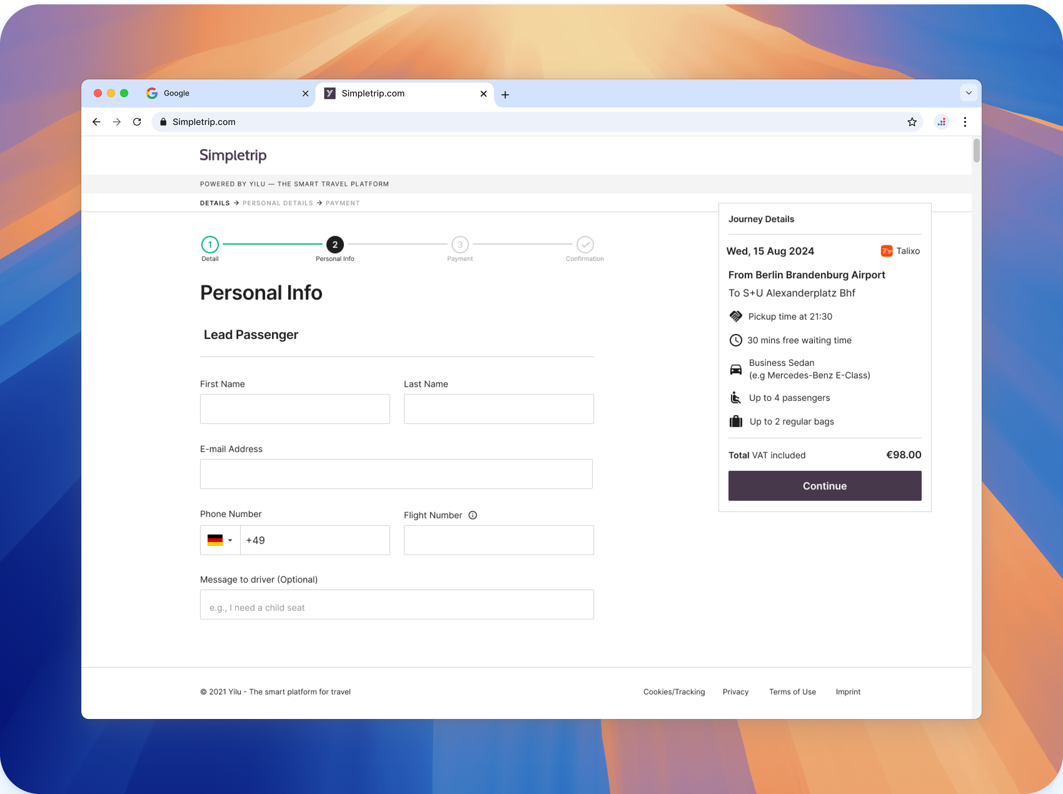
Airport Taxi summary box
role
Product Designer
client
Lufthansa Airlines
Matrex
Reduce user's back and forth between Results page and Personal information page (Hotjar & Datadog)
year
2024
Project Overview:
The airport taxi experience plays a crucial role in providing travelers with a seamless journey from the airport to their destination. After selecting a preferred car, the next step in the booking process is filling out personal information. At this stage, a summary box displays the user’s selected car, destination, date, and time. The challenge was to redesign this summary box to enhance usability and meet user needs.
The Challenge: The existing summary box did not effectively present critical booking details, leading to confusion and potential booking errors. Insights gathered from Lyssna revealed that users often struggled to quickly verify their booking choices, especially under time pressure. Our goal was to create a more intuitive and accessible summary box that ensures clarity and reduces the cognitive load on users.
Research & Insights:
- To better understand user needs, we utilized insights from Lyssna, focusing on how users interact with the summary box during the booking process. Key findings included:
- Users preferred a clear and concise overview of booking details.
- Highlighting the date, time, and destination improved confidence in the booking process.
- Visual hierarchy and color-coding helped users distinguish between critical information and supplementary details.

Design Process:
- We explored two design concepts:
- Design A: Focused on a minimalist approach, prioritizing simplicity and quick readability.
- Design B: Offered a more detailed view, incorporating icons and color accents to guide the user’s attention.
The Solution:
After evaluating user feedback and conducting usability tests, we decided on: Design B.
This design effectively combined a clean layout with helpful visual cues, ensuring that users could quickly verify all booking information at a glance. The use of icons and colors contributed to a more organized and reassuring experience.
Outcome:
Though quantitative results are still being collected, early feedback has been positive. Users have expressed appreciation for the improved clarity and ease of use. We expect to see a reduction in booking errors and increased user satisfaction.
Reflection:
This project reinforced the importance of user-centric design and the value of testing multiple design iterations. Collaborating closely with the research team and incorporating real user insights led to a well-informed design choice. Moving forward, I aim to apply these learnings to ensure that every design decision is backed by solid research and user feedback.