
Confirmation page case study
role
Product Designer
client
Lufthansa Airlines
Matrex
Reassurance that the booking is successful
year
2024
Project Overview:
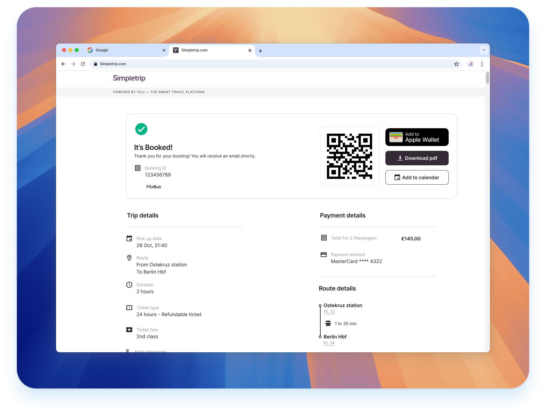
For this project, our goal was to redesign the confirmation page for airport transfers (Bus-Train) on the platform. The primary focus was on restructuring the information architecture and prioritizing content based on user feedback and card sorting exercises.
The Challenge:
After completing the booking steps, users landed on a confirmation page that needed a clearer and more intuitive presentation of information. The previous design lacked a clear hierarchy, causing confusion about important trip details and next steps.
Objectives:
Improve the clarity and hierarchy of the confirmation page.
Prioritize essential information according to user needs.
Enhance the overall user experience by reducing confusion and creating a smoother post-booking process.
.png)
Research & Insights:
To guide the redesign, I conducted user interviews and ran card sorting sessions. These methods helped identify which pieces of information were most critical to users at this stage, such as:
Trip details (date, time, pick-up and drop-off points)
Provider contact information
Instructions for the transfer (e.g., ticket usage, where to find the bus/train)
Design Approach:
Wireframes & Initial Concepts: I developed wireframes to test different layouts and hierarchies.
Design Iterations: Two design options were created, focusing on:
- Information grouping based on user priorities.
- Visual hierarchy using typography and spacing.
- Adding contextual tips and guidance where needed.
User Testing: The designs were tested with real users to gather feedback on clarity and usability.
Final Designs:
The chosen design presented key information prominently at the top of the page, with secondary details in a clear, accessible layout. The page included:
- A quick-glance section with trip essentials.
- Step-by-step guidance for the day of travel.
- Easy access to support and additional resources.
Outcome & Impact:
The updated confirmation page led to a noticeable decrease in support queries related to trip details. User satisfaction scores for the post-booking experience improved, reflecting a more streamlined and user-friendly design.
Takeaways:
- The importance of understanding user priorities through research.
- How card sorting can guide effective information architecture.
- Balancing aesthetic design with functional clarity to support user needs.